Complete brand renovation for an established Burlington restaurant, transforming an outdated, unusable logo into a cohesive system that works across all touchpoints.
Challenge
Butter is a Burlington community hub where people gather for elevated comfort food, trivia nights, live music, and more.
The original logo was difficult to work with, using fonts that were hard to read and imagery that didn’t serve a larger whole. The colors were outdated and didn’t reflect the vibrant community hub Butter was trying to become.
Beyond the logo itself, there wasn’t a broader brand system to work from. No established typography hierarchy, no defined color palette, no supporting graphic elements. This made it challenging to create new materials that felt cohesive and intentional.
ORIGINAL LOGO
I approached this as a brand renovation: taking what existed and rebuilding it from the ground up.
Discovery and Research
I started by understanding what Butter Bar actually is: not just a restaurant, but a spot where the community comes together.
Iterations
I explored different directions that could honor their name while playing a role in the larger whole of the brand.
Refinement & System Building
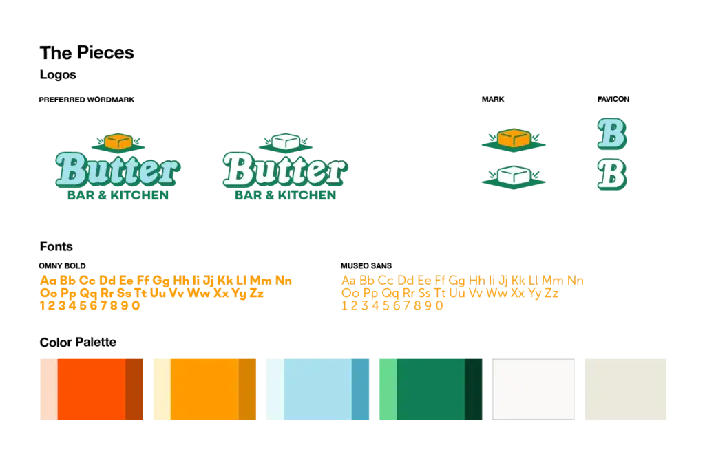
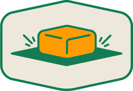
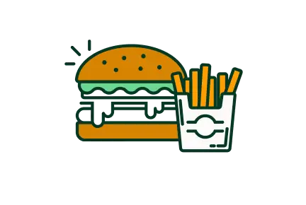
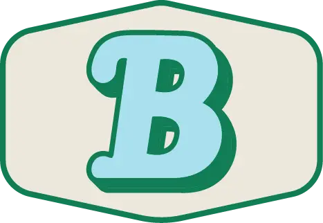
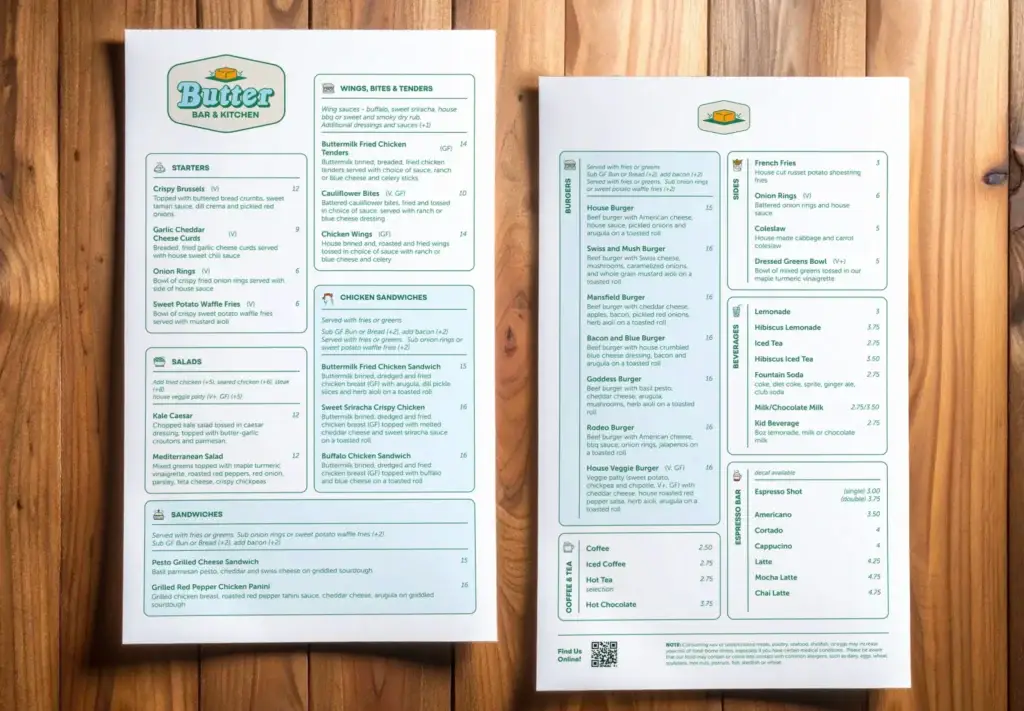
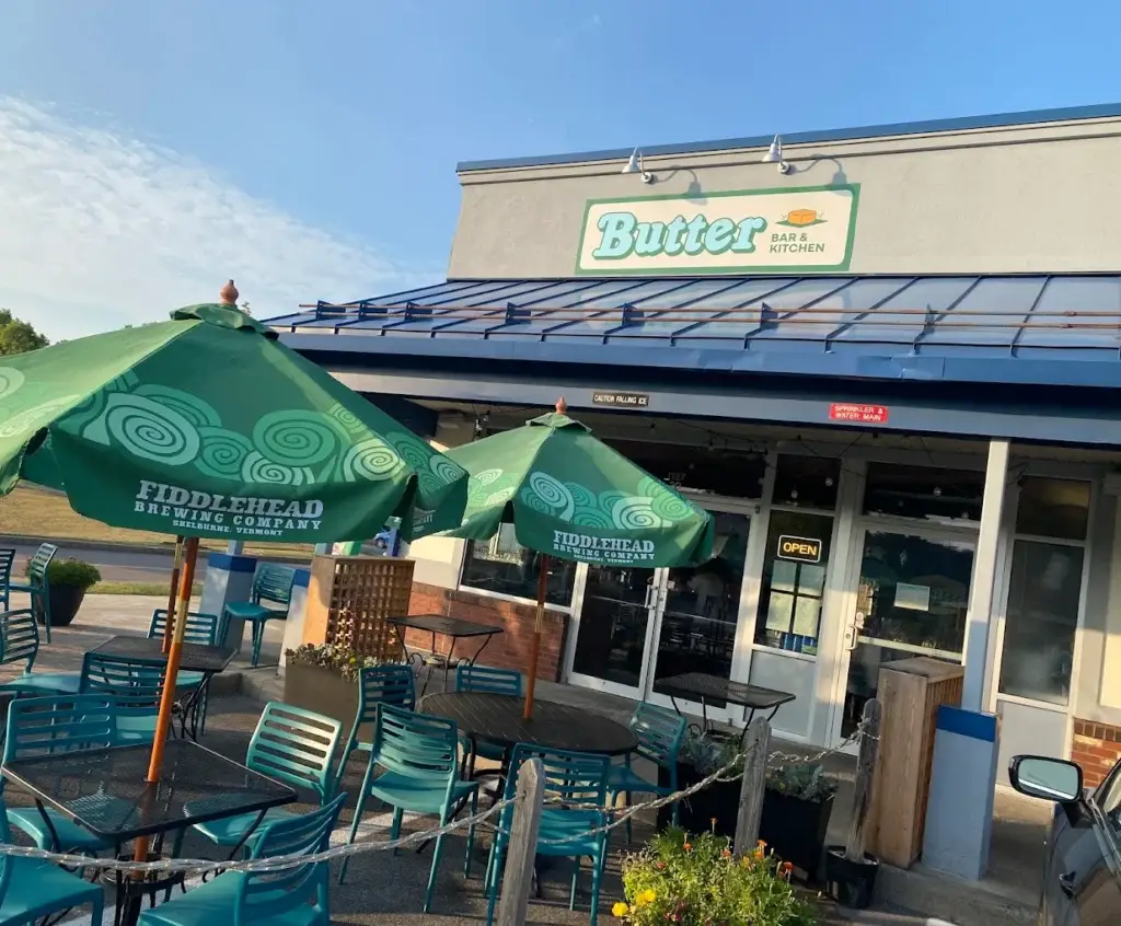
Once the logo was locked, the real work began. I built out a complete color palette, created custom iconography that matched the refined butter icon, designed logo variations for web and social, developed patterns, and applied the system across menus, printed materials, large signage, gift cards, and wayfinding.
Result
Butter now has a logo that works at every size, in every application, in any color. The team can make updates to the menu and signage easily using the provided templates and feel confident in their decisions.
This brand renovation took something that existed in name only and rebuilding it into a complete, functional system that serves the business and honors the community it’s built.